BACHMANN
/ GRAPHIC CONCEPT & SOLUTIONS / PRODUCT SHOOTS / PHOTO RETOUCHING / CATALOG DESIGN / PACKAGING / PREPRESS / PRINT /
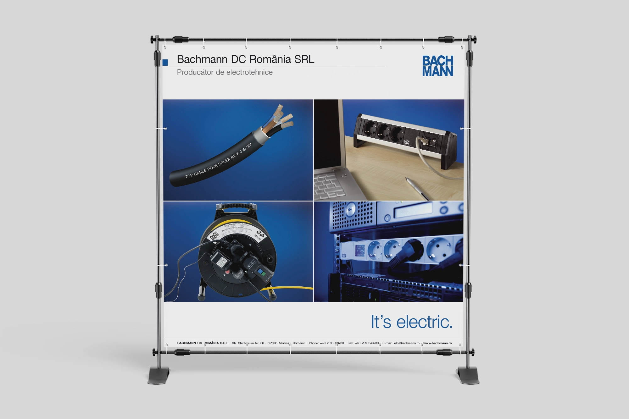
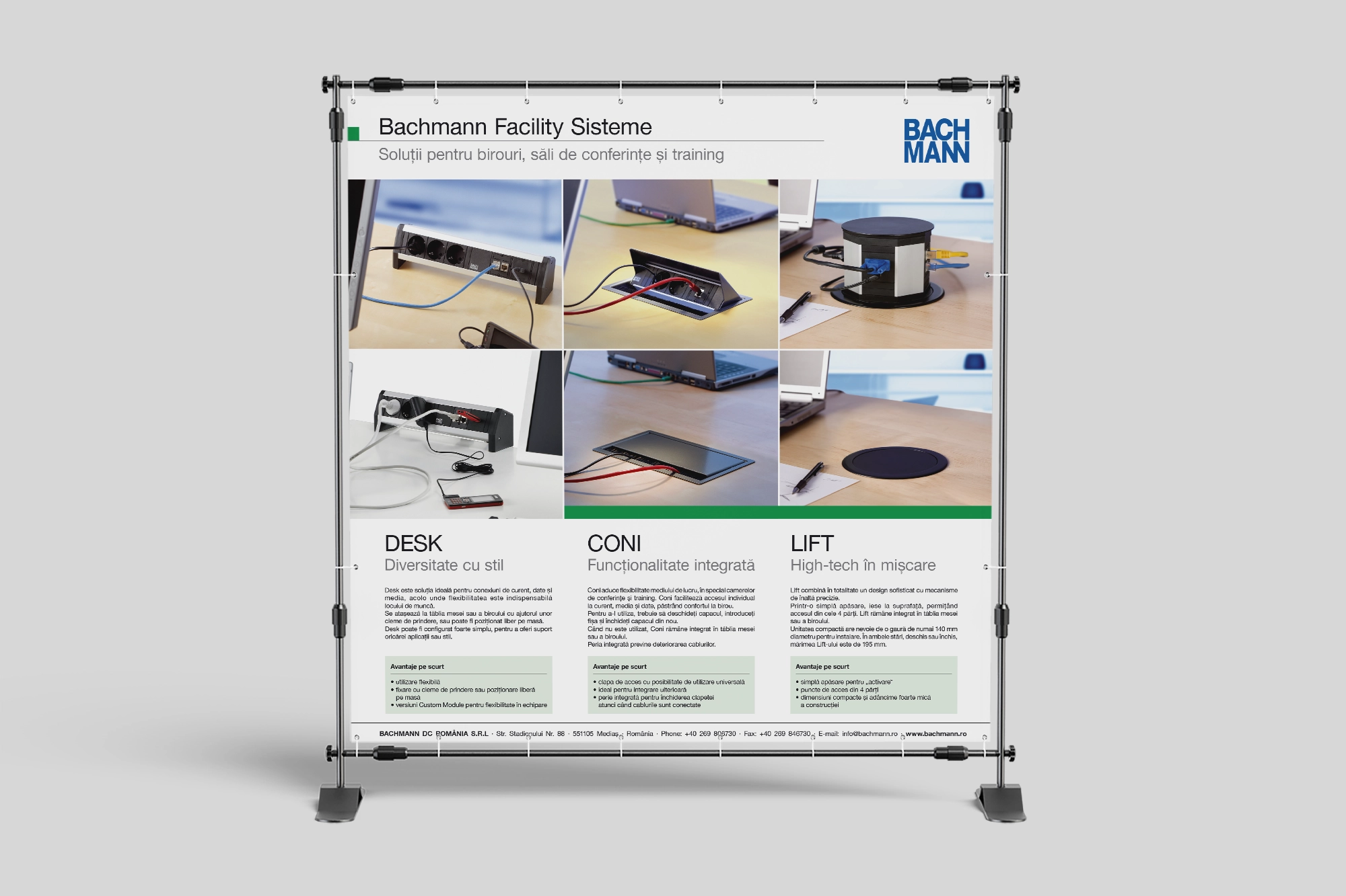
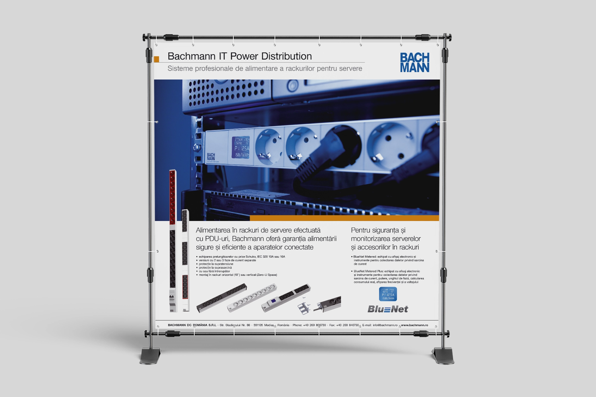
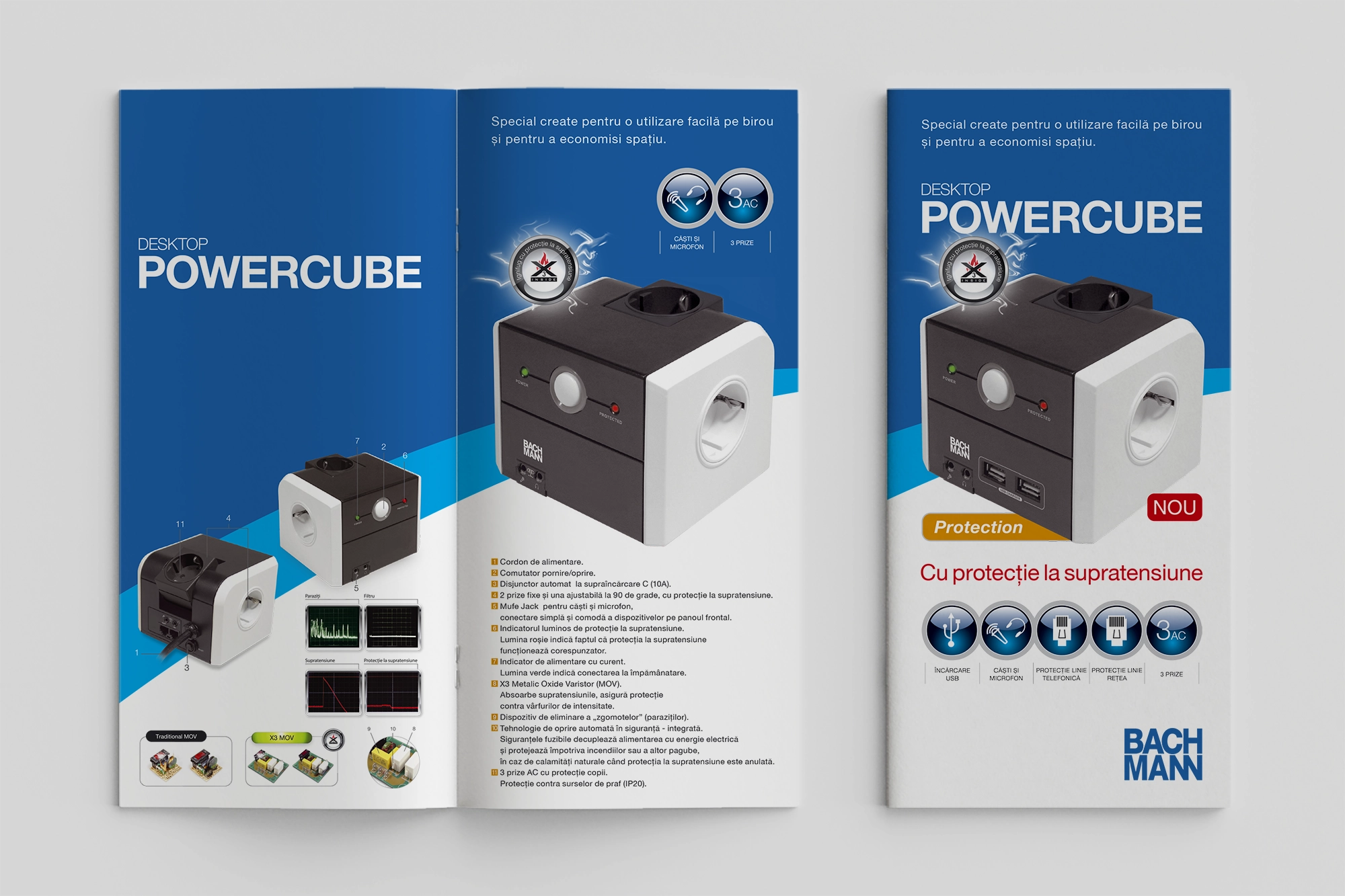
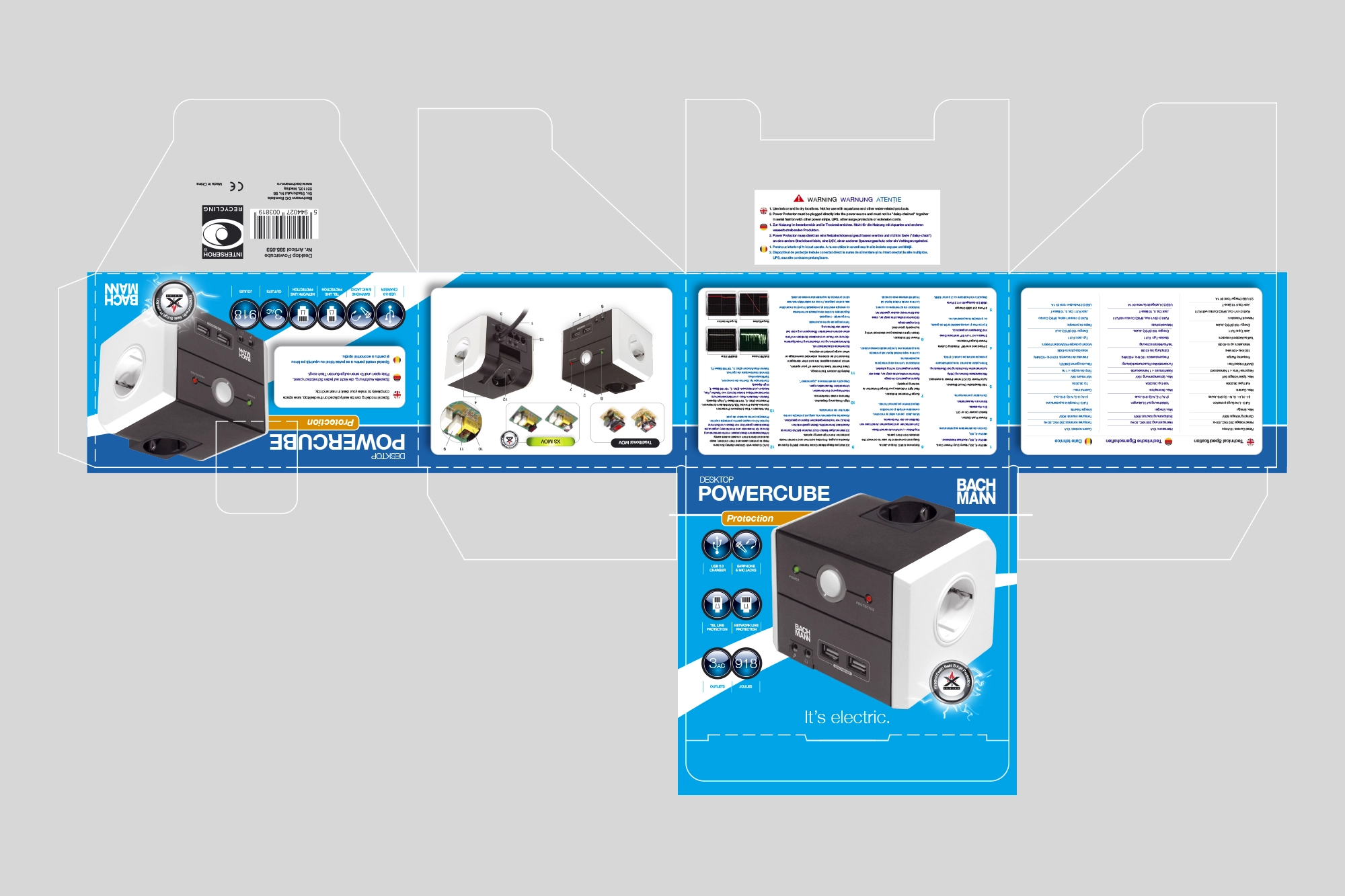
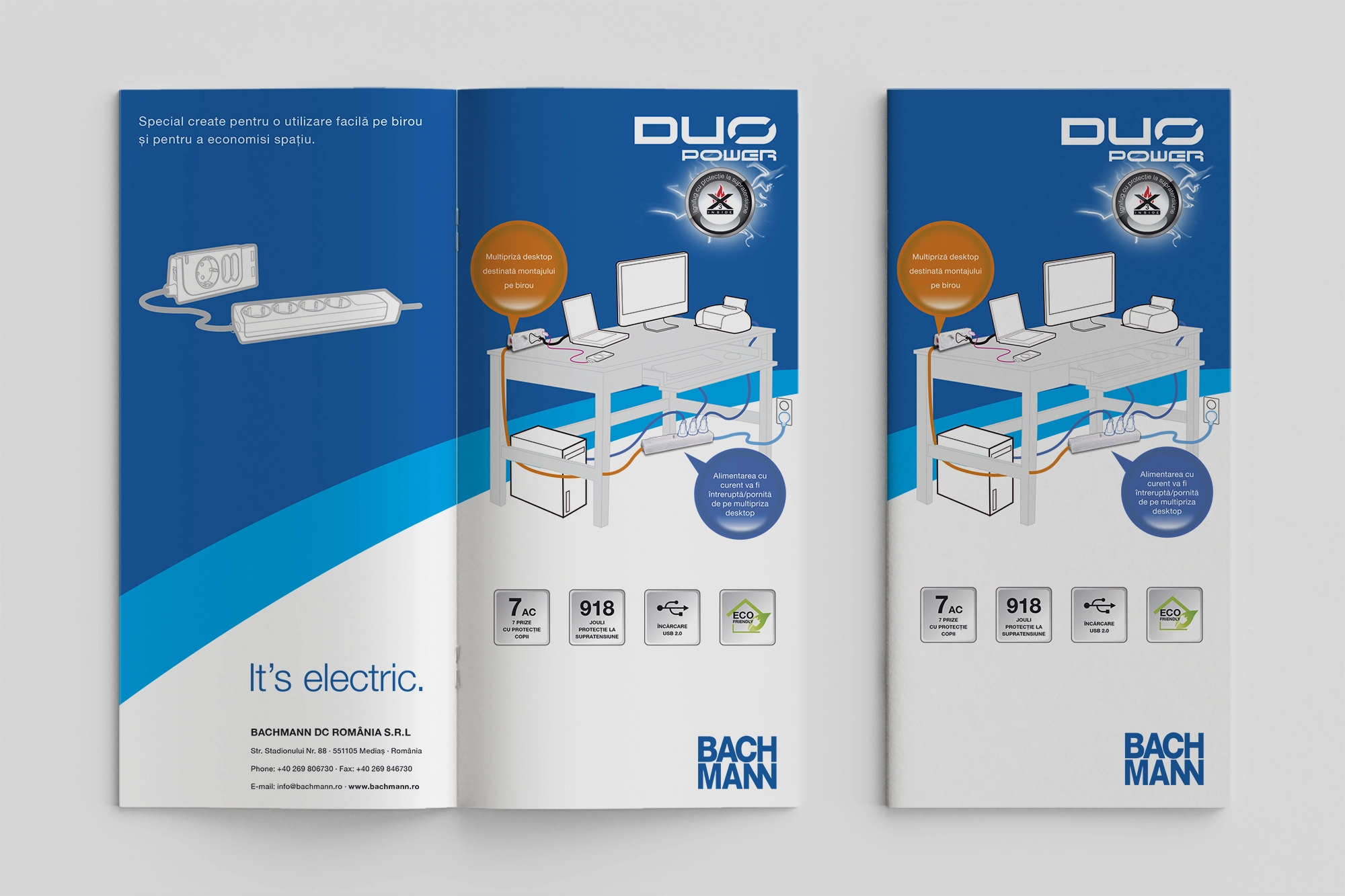
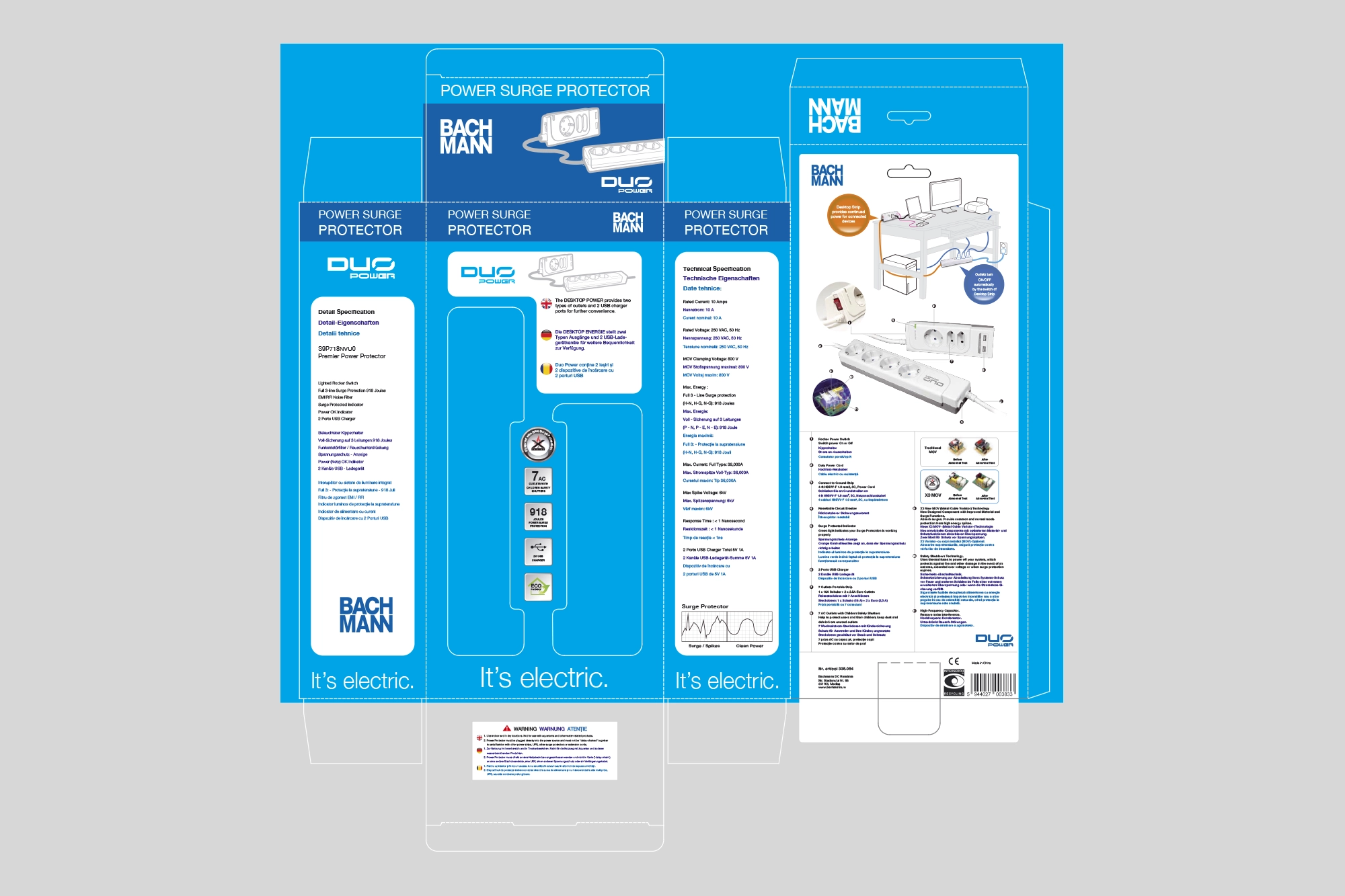
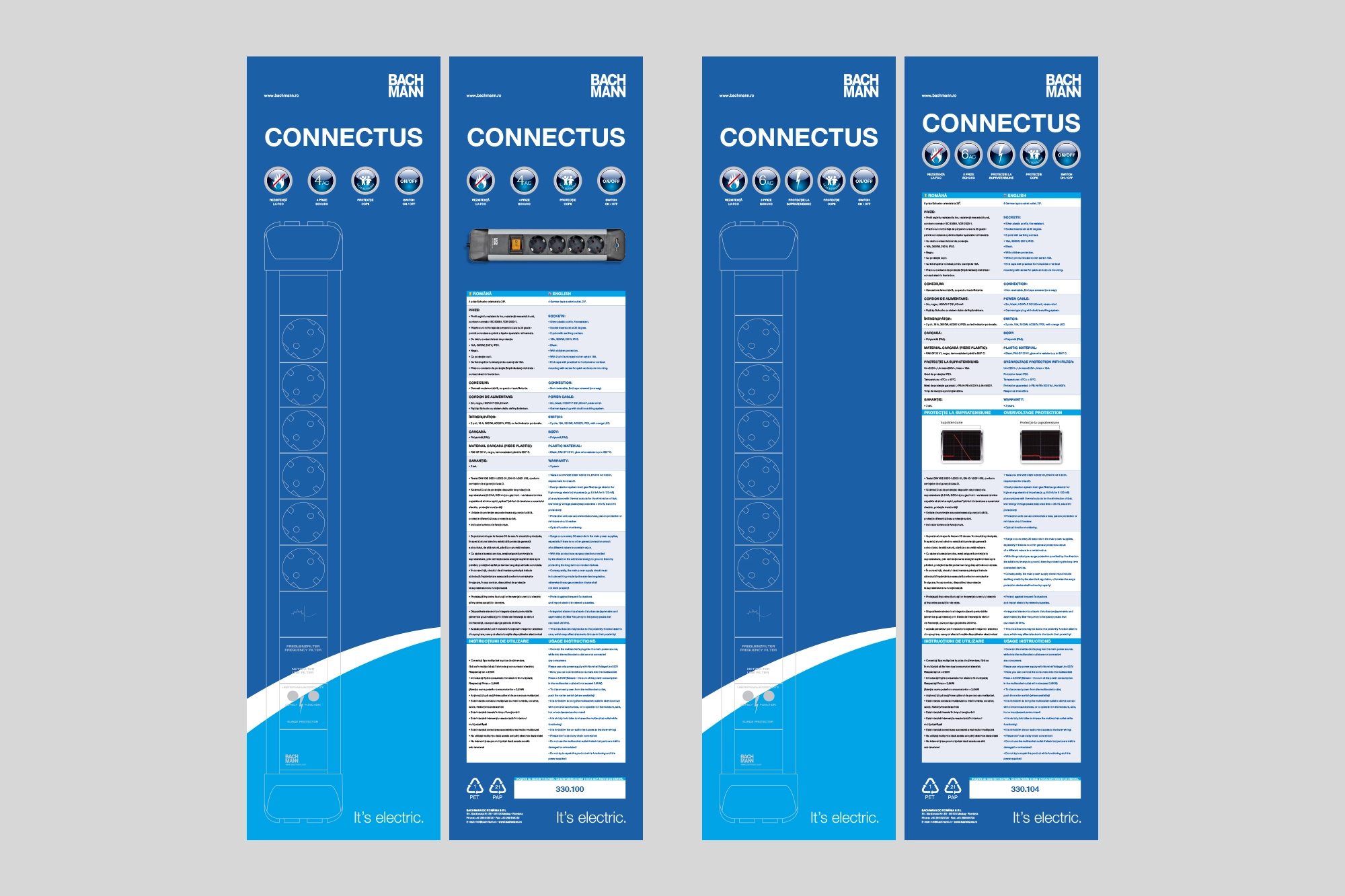
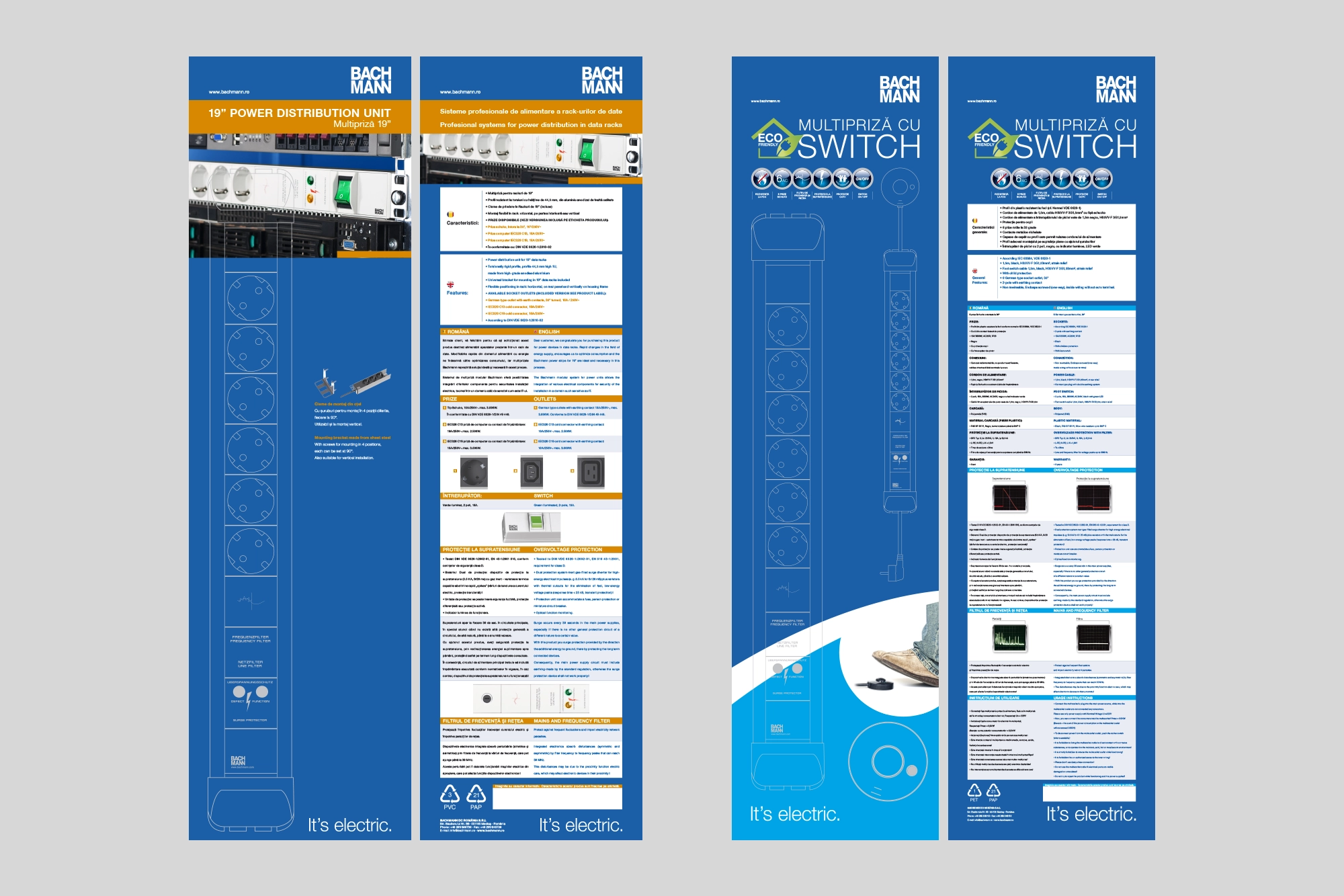
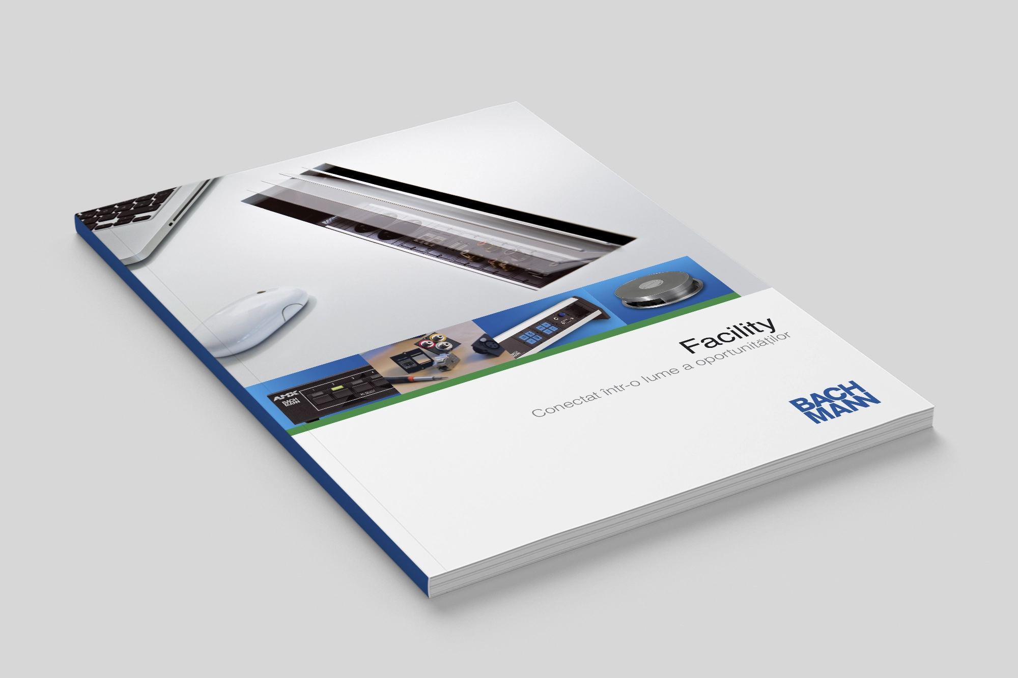
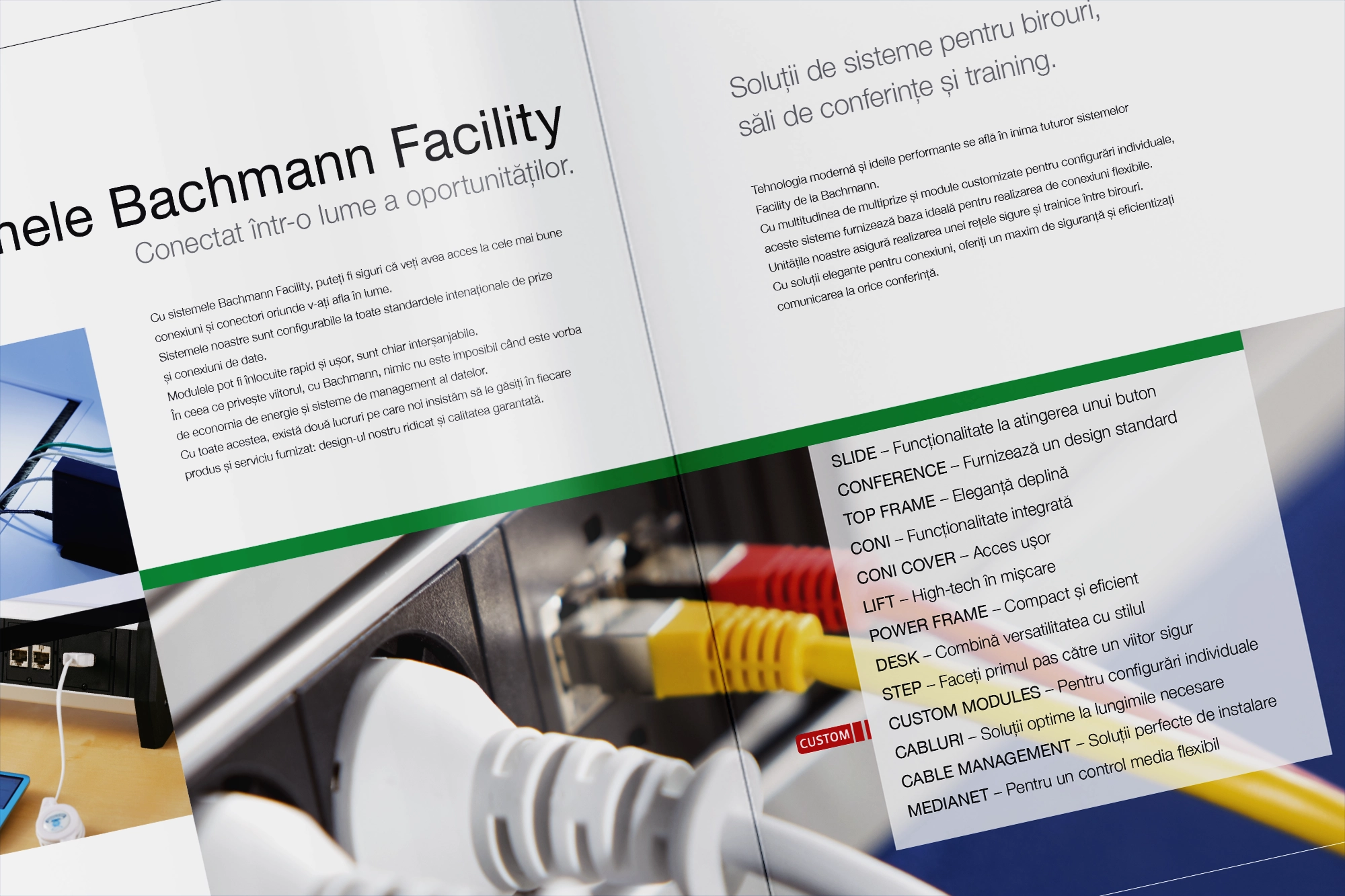
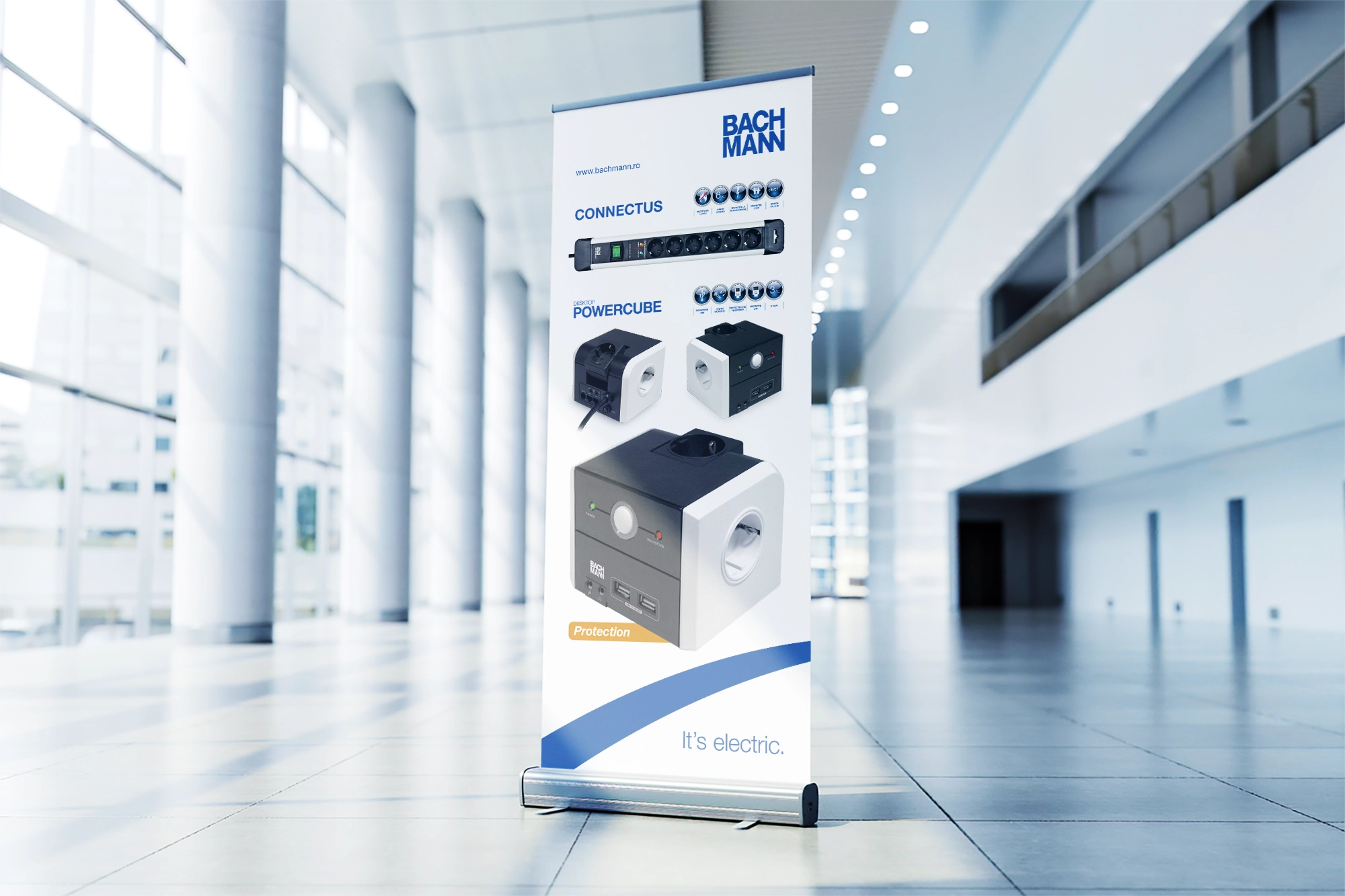
The collection of visuals demonstrates a consistent, high‑level design language that positions Bachmann as a modern, reliable, and technically competent brand. Across brochures, packaging layouts, banners, and product panels, the work maintains a clean corporate aesthetic built on structured grids, precise alignment, and a disciplined use of blue, white, and neutral tones. This creates a unified identity that feels both technical and approachable.
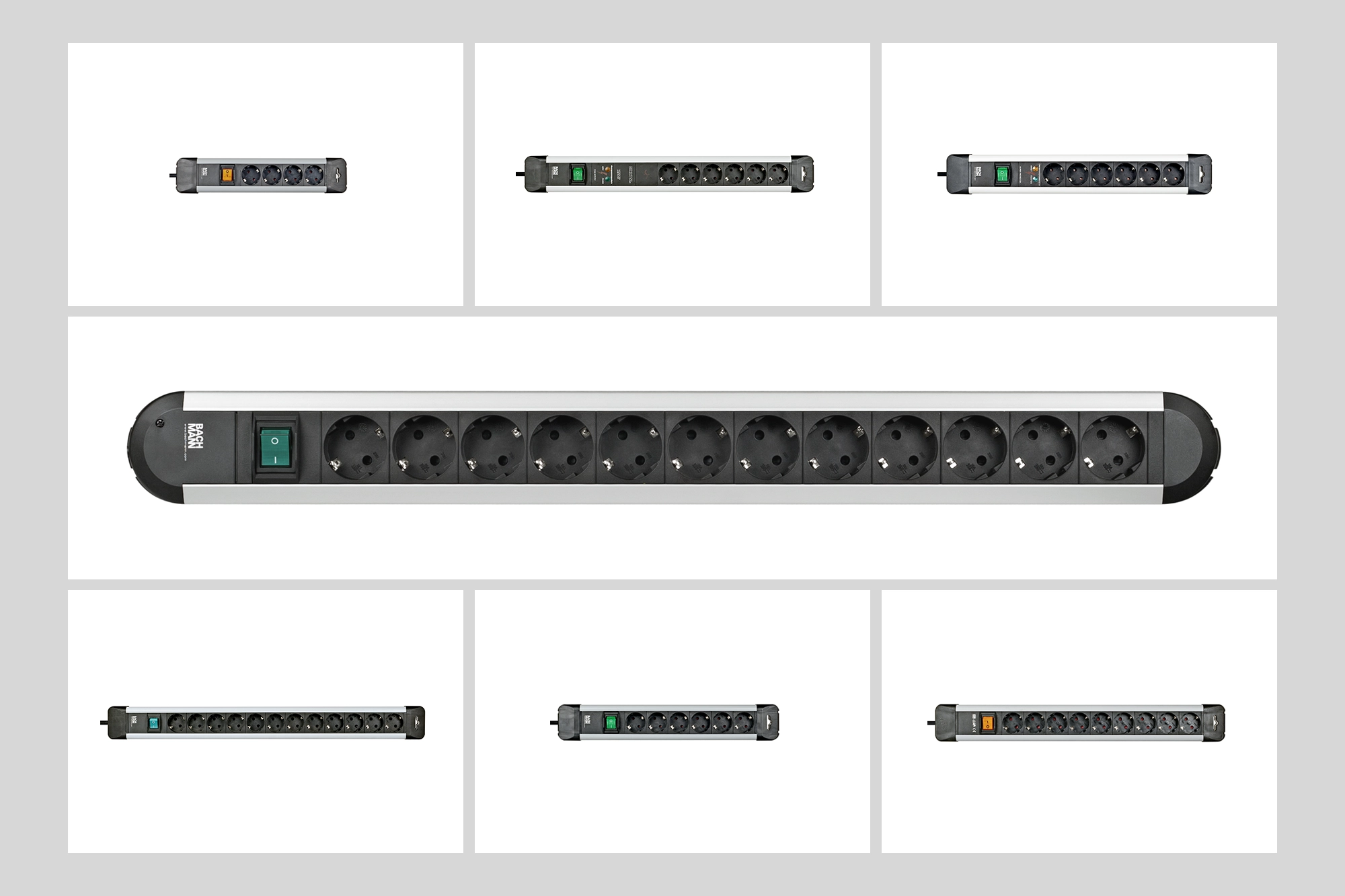
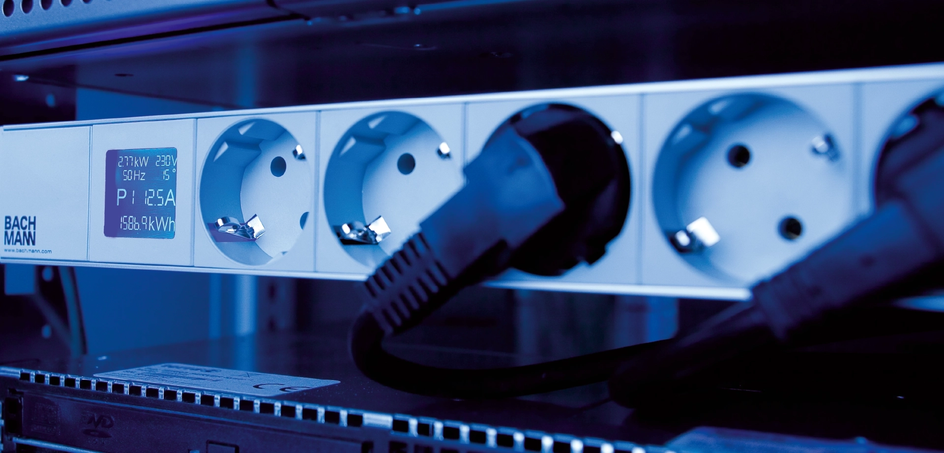
Product photography and renderings are integrated with clarity, always giving priority to functionality and engineering detail. Icons, diagrams, and specification blocks are used effectively to communicate complex information in a way that remains visually digestible. The balance between imagery and text shows a strong understanding of hierarchy and user attention flow.
Overall, the materials reflect a professional, trustworthy brand image: technically solid, visually coherent, and clearly crafted with attention to detail. Guliman's design approach emphasizes order, clarity, and product credibility — exactly what a company in the electrotechnical sector needs to inspire confidence.